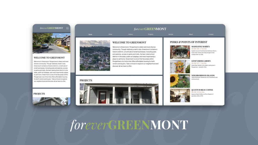
What is Forever Greenmont?
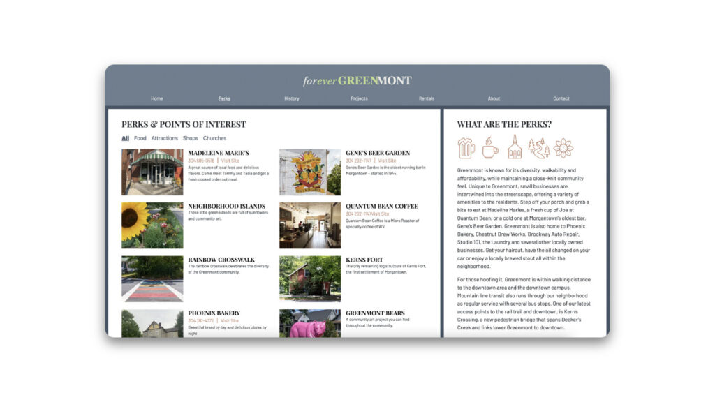
Forever Greenmont is a home renovation and restoration blog for properties based in the Greenmont area of Morgantown, WV. This site is designed as a promotional tool for the Schaupp family’s projects which eventually turn into rentals. Including a “Perks & Points of Interest Page” as well as a “History” page that tells the story of the neighborhood’s beginnings, visitors can learn everything they need to know if they are interested in moving into the area.
What Were Our Client’s Goals?
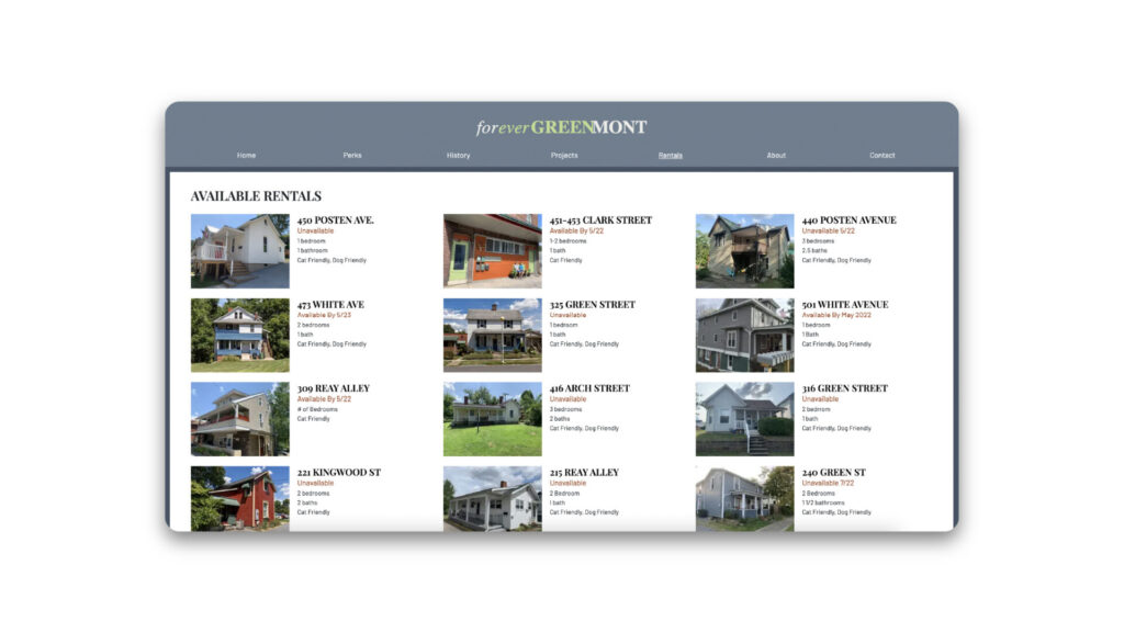
Our clients’ goals were to build a website where she could share her passion for flipping homes while at the same time renting out previously renovated homes to increase their profit margin. Adelheid and Gary (our clients) ran a very hands-on operation, and are very well liked by the Greenmont community, therefore, word of mouth was a great marketing tool for them. The next logical step in expanding their business was to have a strong web presence to share their work and gain new customers.
Web Tools
Forever Greenmont’s site was built with a completely custom WordPress theme. After getting style tiles (Adobe Illustrator) approved by Adelheid, we moved on to wireframes, mockups and prototyping (Adobe XD). Once all components were approved, we coded the barebones website (Atom, Github) and shared for review. The next phase was to integrate this site into WordPress so Adelheid and her team could add/remove rental properties, blog posts, and add photos to their exact liking.
SEO and Analytics
This is one of the first sites that we addressed SEO and analytics on as we had previously only designed and developed the sites. We included meta tags and preview images for when people share their website to social media. We also played a role in pushing Adelheid to set up a Facebook page to help drive traffic to the website. Google analytics tracks the website’s traffic, and we are happy to see that reports consistently show high-volume traffic, especially from social media platforms.
Photography
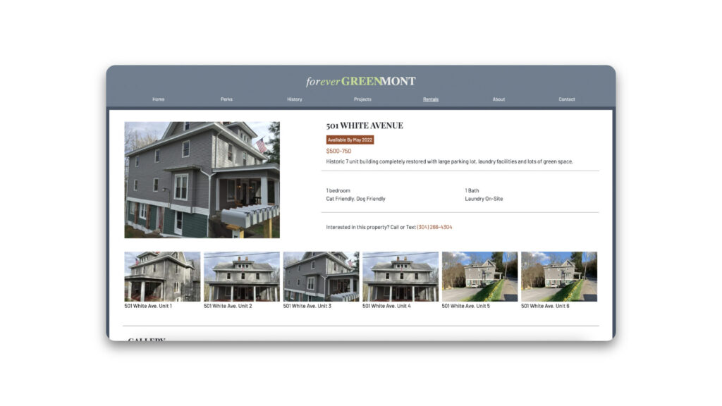
One thing that our team noticed early on is that all of their photography was taken using cell phones, therefore the quality and orientation of photos were inconsistent. Of course, this to no fault of our client, the best camera is the one you have on hand! But, we loved working with Adelheid so much that we included a complementary photoshoot to get her started, and gave her a crash course of how to take the best photos possible using her phone for future projects.
One thing we did to keep photos consistent on a grid was to include code that crops photos to specific dimensions regardless of the original aspect ratio of the uploaded photos. This is a great way to control the layout while giving your client freedom to upload their own content worry-free.
*NOTE: Our photography is now mixed in with many photos taken by the website owners. To see samples of our original photography, visit our Forever Greenmont portfolio page.
Branding/Style
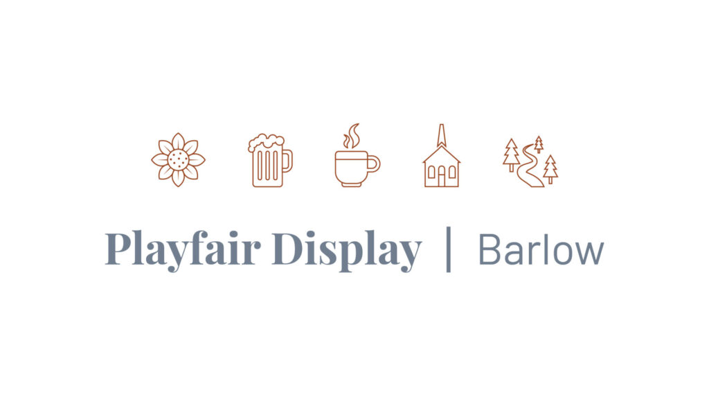
The Forever Greenmont brand was not established before this project. In fact, the name had not been decided on either. Adelheid compiled a list of names that she liked and we encouraged her to go with Forever Greenmont, specifically because we liked the idea of combining the words to create a third word, “evergreen”. The logotype, icons, color palette, and type pairing are all original works that we designed for this website to visually unify their brand.
Final Thoughts
This website is a content-rich online hub for Forever Greenmont. Housing a blog, rental pages, a history section, and even a perks page, we designed this site to compliment Adelheid’s passion for storytelling through her work. It was clear to us from the start that not only is this a business to her, but it is a passion project that she wanted to share with a larger audience. Forevergreenmont.com has been live for roughly two years and continues to get consistent traffic and new content regularly.