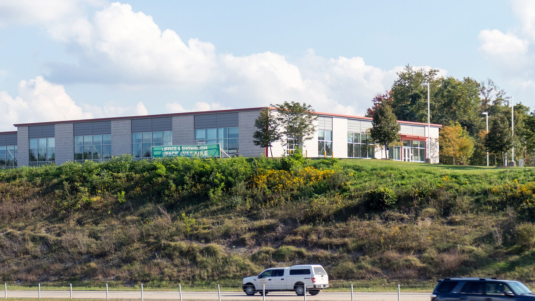
The Concorde: Commercial Real Estate Branding
We branded The Concorde commercial office space, named after the aircraft and reflecting its proximity to the Pittsburgh International Airport, with a sleek, minimalistic identity that emphasizes simplicity. The bright red colors, inspired by the building’s exterior trims, add a distinctive touch without overwhelming graphic elements, aligning perfectly with the property’s flexible usage and non-retail focus.
Timeline: 2022
Role: Branding + UI/UX Consultancy
Client: Burns Scalo Real Estate
Brand + Identity
The logo for The Concorde features a series of four right triangles aligned to form a square outer frame, with each diagonal row of triangles filled in progressively lighter shades of gray. This design element suggests movement and dynamism, evoking the image of a plane taking off. Pairing this logo with a clean, industrial-like yet friendly font family, Poppins, The Concorde’s brand identity unifies the messaging for the property and its marketing materials.
Related Projects:
Commercial Real Estate Branding
No results. Please modify your search and filters and try again.
Related Reading:
Commercial Real Estate Branding
No results. Please modify your search and filters and try again.